Wednesday, October 27, 2010

Mathematica Box and Whisker Plot

I am trying to find a visualization to describe the distribution of our assessement data.  With a box and whisker plot, I can show the five statistical summary (minimum, maximum, first quartile, median and third quartile) in one chart.  I can create a chart for each assessment dimension, and put them side by side together.

It is surprisingly easy to do it programmatically in Mathematica,  Starting with a list of ratings (raters, ratings of dimension 1, 2, 3 and 4), then one single line of code using BoxWhiskerPlot function.  That's it!
BoxWhiskerPlot[
 Select[ratings[[All, 2]], NumberQ],
 Select[ratings[[All, 3]], NumberQ],
 Select[ratings[[All, 4]], NumberQ],
 Select[ratings[[All, 5]], NumberQ],
 BoxLabels -> {Style[dimensionnames[[1]], 11,
    FontFamily -> "Tahoma"],
   Style[dimensionnames[[2]], 11, FontFamily -> "Tahoma"],
   Style[dimensionnames[[3]], 11, FontFamily -> "Tahoma"],
   Style[dimensionnames[[4]], 11, FontFamily -> "Tahoma"]},
 BoxFillingStyle -> {RGBColor[0.3, 0.6, 0.9, 1],
   RGBColor[0.5, 0.7, 0.3, 1], RGBColor[1, 0.5, 0, 1],
   RGBColor[0.71, 0.22, 0.26, 1]},
 PlotLabel ->
  Style[DisplayForm[
    GridBox[{{"Assessment 2010"}, {"Box covering 50% of data (N=" ~~
        ToString[Nsize] ~~ "Programs)"}, {" "}}]], "Title", 14],
 FrameLabel -> {None, Style["Ratings", 11, FontFamily -> "Tahoma"]},
 BoxOutliers -> Automatic,
 PlotRange -> {Automatic, {0, 6.5}},
 ImageSize -> {520, 300}]
 

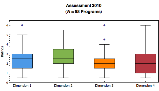
Mathematica also has an option to choose whether to show outliers.

I have created a lot more different kinds of visualizations, including an interactive sector chart.  Thanks to the Mathematica's Manipulate (or the MSPManipulate in webMathematica) function.  I will post them here when I have more time.

Mathematica, I am loving it!

Monday, October 25, 2010

Mathematica Bubble Chart

I was trying to show correlation between two dimensions visually in an assessment project.  I didn't feel the regular plot would do enough justice since the dots that overlap only count as 1.  So I experimented in using the bubble chart in Mathematica.

Here is the code:
ratingpairstally = Tally[ratingpairs];
bubbledata = {};
For[i = 1, i <= Length[ratingpairstally], i++,
  AppendTo[bubbledata,
    Join[ratingpairstally[[i, 1]], {ratingpairstally[[i, 2]]}]];
  ];

Show[
    Plot[{fitline}, {x, 0, 6},
  PlotLabel ->
   Style[DisplayForm[
     GridBox[{{"Assessment 2010"}, {dimensionnames[[1]] ~~ " vs " ~~
         dimensionnames[[4]] ~~ "(" ~~ ToString[Nsize] ~~
         "Programs)"}, {" "}}]], "Title", 14],
  AxesLabel -> {Style[dimensionnames[[4]], 11,
     FontFamily -> "Tahoma"],
    Style[dimensionnames[[1]], 11, FontFamily -> "Tahoma"]},
  PlotStyle -> Gray,
  PlotRange -> {{0, 6.5}, {0, 6.5}},
  AspectRatio -> Automatic,
  ImageSize -> {350, 350}]
 ,
 BubbleChart[bubbledata,
  ChartStyle -> RGBColor[0.3, 0.6, 0.9, 1]]
 ]

Basically, I have pairs of ratings stored in a list called ratingpairs.  I then used the Tally function to get the count of all distinct value of rating pairs.  Formatted the output properly into another list called bubbledata, ready to be plotted.  I use the Show function so I can put the bubble chart, and the line of best fit together.  Viola!