Monday, June 27, 2011

To Escape % Character in SAS PROC SQL

Suppose you want to run a query to find all records containing the pattern "REQUIRED" in a certain column, the SQL where clause will look something as follows:
where thetextfield like "%REQUIRED%"
But if you use it inside SAS, SAS will interpret the %REQUIRED as a macro and throw an error.  Here is how you can escape the % character:
%let pattern=%nrstr(%%)REQUIRED%str(%%);
proc sql;
create table new_dataset as
select * from dataset
where thetextfield like "&pattern.";
quit;
You can also put the code inside a macro, and have the pattern "REQUIRED", etc as a parameter to be passed into the macro.
%macro get_records_with_pattern(pattern);
    %let patternlike=%nrstr(%%)&pattern.%str(%%);
    proc sql;
    create table new_dataset as
    select * from dataset
    where thetextfield like "&patternlike.";
    quit;
%mend get_records_with_pattern;
Now you can call the macro with the parameter REQUIRED and many more.
%get_records_with_pattern(REQUIRED);
%get_records_with_pattern(ACCEPTED);
%get_records_with_pattern(PASSED);

Friday, March 25, 2011

Calculating Cumulative Percentage In PROC REPORT With ACROSS

I am finally able to get cumulative percentages calculated when /across is used in PROC REPORT.  Basically I have to programmatically calculate it in the code, and put the resulting value into the columns directly (such as _c4_ for column 4, _c7_ for column 7).  I contacted SAS technical support on this, and confirmed there was no way around this hard-coding of column number.  How sad!

Here is the SAS code, with column numbers hard-coded, but at least it works:
options missing=0;
proc report data = some_dataset nowd missing;
column credit_load snapshotdate,(ones ones=onespct cumpct) dummy;
define credit_load        / group 'Credit Load' ;
define snapshotdate     / across '' order=internal;
define ones                     / analysis sum 'Freq' style(column)={tagattr="format:##0"}    ;
define onespct               / analysis pctn 'Pct' style(column)={tagattr="format:##0.0%"};
define cumpct               / 'Cum Pct' style(column)={tagattr="format:##0.0%"};
define dummy              / noprint;

COMPUTE BEFORE ;
    cumtot1 = 0;
    cumtot2 = 0;
ENDCOMP;

COMPUTE dummy;
    cumtot1 + _c3_;
    cumtot2 + _c6_;

    _c4_ = cumtot1;
    _c7_ =  cumtot2;

    IF _BREAK_="_RBREAK_" THEN DO;
      _c4_=1;
      _c7_=1;
    END;
ENDCOMP;

rbreak after / summarize ;

run;

Wednesday, October 27, 2010

Mathematica Box and Whisker Plot

I am trying to find a visualization to describe the distribution of our assessement data.  With a box and whisker plot, I can show the five statistical summary (minimum, maximum, first quartile, median and third quartile) in one chart.  I can create a chart for each assessment dimension, and put them side by side together.

It is surprisingly easy to do it programmatically in Mathematica,  Starting with a list of ratings (raters, ratings of dimension 1, 2, 3 and 4), then one single line of code using BoxWhiskerPlot function.  That's it!
BoxWhiskerPlot[
 Select[ratings[[All, 2]], NumberQ],
 Select[ratings[[All, 3]], NumberQ],
 Select[ratings[[All, 4]], NumberQ],
 Select[ratings[[All, 5]], NumberQ],
 BoxLabels -> {Style[dimensionnames[[1]], 11,
    FontFamily -> "Tahoma"],
   Style[dimensionnames[[2]], 11, FontFamily -> "Tahoma"],
   Style[dimensionnames[[3]], 11, FontFamily -> "Tahoma"],
   Style[dimensionnames[[4]], 11, FontFamily -> "Tahoma"]},
 BoxFillingStyle -> {RGBColor[0.3, 0.6, 0.9, 1],
   RGBColor[0.5, 0.7, 0.3, 1], RGBColor[1, 0.5, 0, 1],
   RGBColor[0.71, 0.22, 0.26, 1]},
 PlotLabel ->
  Style[DisplayForm[
    GridBox[{{"Assessment 2010"}, {"Box covering 50% of data (N=" ~~
        ToString[Nsize] ~~ "Programs)"}, {" "}}]], "Title", 14],
 FrameLabel -> {None, Style["Ratings", 11, FontFamily -> "Tahoma"]},
 BoxOutliers -> Automatic,
 PlotRange -> {Automatic, {0, 6.5}},
 ImageSize -> {520, 300}]
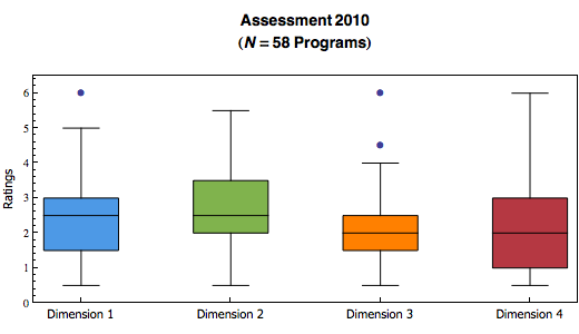
 

Mathematica also has an option to choose whether to show outliers.

I have created a lot more different kinds of visualizations, including an interactive sector chart.  Thanks to the Mathematica's Manipulate (or the MSPManipulate in webMathematica) function.  I will post them here when I have more time.

Mathematica, I am loving it!

Monday, October 25, 2010

Mathematica Bubble Chart

I was trying to show correlation between two dimensions visually in an assessment project.  I didn't feel the regular plot would do enough justice since the dots that overlap only count as 1.  So I experimented in using the bubble chart in Mathematica.

Here is the code:
ratingpairstally = Tally[ratingpairs];
bubbledata = {};
For[i = 1, i <= Length[ratingpairstally], i++,
  AppendTo[bubbledata,
    Join[ratingpairstally[[i, 1]], {ratingpairstally[[i, 2]]}]];
  ];

Show[
    Plot[{fitline}, {x, 0, 6},
  PlotLabel ->
   Style[DisplayForm[
     GridBox[{{"Assessment 2010"}, {dimensionnames[[1]] ~~ " vs " ~~
         dimensionnames[[4]] ~~ "(" ~~ ToString[Nsize] ~~
         "Programs)"}, {" "}}]], "Title", 14],
  AxesLabel -> {Style[dimensionnames[[4]], 11,
     FontFamily -> "Tahoma"],
    Style[dimensionnames[[1]], 11, FontFamily -> "Tahoma"]},
  PlotStyle -> Gray,
  PlotRange -> {{0, 6.5}, {0, 6.5}},
  AspectRatio -> Automatic,
  ImageSize -> {350, 350}]
 ,
 BubbleChart[bubbledata,
  ChartStyle -> RGBColor[0.3, 0.6, 0.9, 1]]
 ]

Basically, I have pairs of ratings stored in a list called ratingpairs.  I then used the Tally function to get the count of all distinct value of rating pairs.  Formatted the output properly into another list called bubbledata, ready to be plotted.  I use the Show function so I can put the bubble chart, and the line of best fit together.  Viola!
 

Monday, December 7, 2009

Radar Chart Gadget verified by Google - Yeah!

Google now requires all custom gadgets to be verified by them in order they can be viewed by collaborators. Refer to the Gadgets: Verifying Custom Gadget Google docs help page for more information.

I had developed a Radar Chart Google Spreadsheet Gadget a while ago. And our department have been using it to visualize the assessment data. So I better submit it to Google for verification as soon as possible.

It took about 3 business days... and YES! As of noon today, Google had verified my radar chart gadget. I hope it will be listed in their gadget gallery soon.

Internet Explorer Strikes Again

Just found out my Radar Chart Google Spreadsheet Gadget did not work on all popular browsers.  Guess which one?!

The error message was:
window.G_vmlCanvasManager is null or not an Object
I swear I had verified it working on Internet Explorer before.
I swear I had not made any change since.
and I swear...
and I swear...

Apparently, there was a problem loading excanvas.js (a javascript to enable HTML5 canvas for Internet Explorer).  As a result, window.G_vmlCanvasManager did not exist.

My original code was:
<content type="html"><![CDATA[
<!--[if IE]><script type="text/javascript" src="http://hosting.gmodules.com/ig/gadgets/file/115560173853763482292/excanvas.js"></script><![endif]-->
<script src="http://www.google.com/jsapi" type="text/javascript"></script>
As it turns out, there needs to be something between <![CDATA[ and the conditional comment <!--[if IE]>... even if it is just a <p> or another <script> line.

So I changed the code to:
<Content type="html"><![CDATA[
<script src="http://www.google.com/jsapi" type="text/javascript"></script>
<!--[if IE]><script type="text/javascript" src="http://hosting.gmodules.com/ig/gadgets/file/115560173853763482292/excanvas.js"></script><![endif]-->
The gadget is working once again.
 

Tuesday, May 12, 2009

Finished - Radar Chart Google Spreadsheet Gadget, That Is!

I believe I have finished the work on creating a Radar Chart Google Spreadsheet Gadget. Here are the changes since my previous release:
  • Added the ability to toggle individual records on and off in the chart. This allows better visual comparison between different records and/or the overall average.
  • Added the ability to toggle the competency line on and off. Also, if user does not input a competency value, the line would not be shown at all.
  • Added better error handling when any of the user inputs, spreadsheet data is not a number.
  • Added a process to determine the real maximum value for scales in radar chart.
  • Fixed the alignment problems of labels with various number of radar lines (columns).
  • Changed the gadget size to have a default height of 250px so it renders properly in iGoogle.
  • Changed the gadget size to use dynamic height for large records set.
  • Added a user configurable refresh time for the gadget, and default is 5 minutes.
  • If "Calculate average" is chosen, then the gadget will draw the radar chart of the overall average by default. Otherwise, it will draw the radar chart of all records.
  • Added a comment field.
This is what the current release looks like:


You can use this gadget with your own spreadsheet data. Here is how:
You can give me feedback via the comments section.

If it looks good, I will submit it to the Google Gadget Gallery in a couple of weeks.