Showing posts with label charting. Show all posts

Wednesday, October 27, 2010

Mathematica Box and Whisker Plot

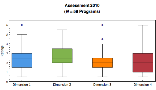
I am trying to find a visualization to describe the distribution of our assessement data.  With a box and whisker plot, I can show the five statistical summary (minimum, maximum, first quartile, median and third quartile) in one chart.  I can create a chart for each assessment dimension, and put them side by side together.

It is surprisingly easy to do it programmatically in Mathematica,  Starting with a list of ratings (raters, ratings of dimension 1, 2, 3 and 4), then one single line of code using BoxWhiskerPlot function.  That's it!
BoxWhiskerPlot[
 Select[ratings[[All, 2]], NumberQ],
 Select[ratings[[All, 3]], NumberQ],
 Select[ratings[[All, 4]], NumberQ],
 Select[ratings[[All, 5]], NumberQ],
 BoxLabels -> {Style[dimensionnames[[1]], 11,
    FontFamily -> "Tahoma"],
   Style[dimensionnames[[2]], 11, FontFamily -> "Tahoma"],
   Style[dimensionnames[[3]], 11, FontFamily -> "Tahoma"],
   Style[dimensionnames[[4]], 11, FontFamily -> "Tahoma"]},
 BoxFillingStyle -> {RGBColor[0.3, 0.6, 0.9, 1],
   RGBColor[0.5, 0.7, 0.3, 1], RGBColor[1, 0.5, 0, 1],
   RGBColor[0.71, 0.22, 0.26, 1]},
 PlotLabel ->
  Style[DisplayForm[
    GridBox[{{"Assessment 2010"}, {"Box covering 50% of data (N=" ~~
        ToString[Nsize] ~~ "Programs)"}, {" "}}]], "Title", 14],
 FrameLabel -> {None, Style["Ratings", 11, FontFamily -> "Tahoma"]},
 BoxOutliers -> Automatic,
 PlotRange -> {Automatic, {0, 6.5}},
 ImageSize -> {520, 300}]
 

Mathematica also has an option to choose whether to show outliers.

I have created a lot more different kinds of visualizations, including an interactive sector chart.  Thanks to the Mathematica's Manipulate (or the MSPManipulate in webMathematica) function.  I will post them here when I have more time.

Mathematica, I am loving it!

Monday, October 25, 2010

Mathematica Bubble Chart

I was trying to show correlation between two dimensions visually in an assessment project.  I didn't feel the regular plot would do enough justice since the dots that overlap only count as 1.  So I experimented in using the bubble chart in Mathematica.

Here is the code:
ratingpairstally = Tally[ratingpairs];
bubbledata = {};
For[i = 1, i <= Length[ratingpairstally], i++,
  AppendTo[bubbledata,
    Join[ratingpairstally[[i, 1]], {ratingpairstally[[i, 2]]}]];
  ];

Show[
    Plot[{fitline}, {x, 0, 6},
  PlotLabel ->
   Style[DisplayForm[
     GridBox[{{"Assessment 2010"}, {dimensionnames[[1]] ~~ " vs " ~~
         dimensionnames[[4]] ~~ "(" ~~ ToString[Nsize] ~~
         "Programs)"}, {" "}}]], "Title", 14],
  AxesLabel -> {Style[dimensionnames[[4]], 11,
     FontFamily -> "Tahoma"],
    Style[dimensionnames[[1]], 11, FontFamily -> "Tahoma"]},
  PlotStyle -> Gray,
  PlotRange -> {{0, 6.5}, {0, 6.5}},
  AspectRatio -> Automatic,
  ImageSize -> {350, 350}]
 ,
 BubbleChart[bubbledata,
  ChartStyle -> RGBColor[0.3, 0.6, 0.9, 1]]
 ]

Basically, I have pairs of ratings stored in a list called ratingpairs.  I then used the Tally function to get the count of all distinct value of rating pairs.  Formatted the output properly into another list called bubbledata, ready to be plotted.  I use the Show function so I can put the bubble chart, and the line of best fit together.  Viola!
 

Monday, December 7, 2009

Radar Chart Gadget verified by Google - Yeah!

Google now requires all custom gadgets to be verified by them in order they can be viewed by collaborators. Refer to the Gadgets: Verifying Custom Gadget Google docs help page for more information.

I had developed a Radar Chart Google Spreadsheet Gadget a while ago. And our department have been using it to visualize the assessment data. So I better submit it to Google for verification as soon as possible.

It took about 3 business days... and YES! As of noon today, Google had verified my radar chart gadget. I hope it will be listed in their gadget gallery soon.

Tuesday, May 12, 2009

Finished - Radar Chart Google Spreadsheet Gadget, That Is!

I believe I have finished the work on creating a Radar Chart Google Spreadsheet Gadget. Here are the changes since my previous release:
  • Added the ability to toggle individual records on and off in the chart. This allows better visual comparison between different records and/or the overall average.
  • Added the ability to toggle the competency line on and off. Also, if user does not input a competency value, the line would not be shown at all.
  • Added better error handling when any of the user inputs, spreadsheet data is not a number.
  • Added a process to determine the real maximum value for scales in radar chart.
  • Fixed the alignment problems of labels with various number of radar lines (columns).
  • Changed the gadget size to have a default height of 250px so it renders properly in iGoogle.
  • Changed the gadget size to use dynamic height for large records set.
  • Added a user configurable refresh time for the gadget, and default is 5 minutes.
  • If "Calculate average" is chosen, then the gadget will draw the radar chart of the overall average by default. Otherwise, it will draw the radar chart of all records.
  • Added a comment field.
This is what the current release looks like:


You can use this gadget with your own spreadsheet data. Here is how:
You can give me feedback via the comments section.

If it looks good, I will submit it to the Google Gadget Gallery in a couple of weeks.

Tuesday, May 5, 2009

My First Radar Chart Google Spreadsheet Gadget

The charts and gadgets in Google spreadsheet offer a number of interesting ways to help in visualizing our assessment data. Gadgets further offer a way to present the visualization information into a web page or one's iGoogle page. However, Google spreadsheet does not have a radar chart gadget by default which is an important piece in visualizing data harvested in our transformative assessment effort (currently known as the Harvesting Grade Book). For a brief background information, see my post on Using Google Chart API to Implement Harvesting Grade Book.

I started to look into ways to combine the Google Chart API, Spreadsheet API and Gadget API. While searching around, I found that Greg Schechter had made a spider web google spreadsheet gadget and it is listed in the Google Visualization API Gadget Gallery. Great!

But as it turns out, it does not provide all the functionalities we need, such as calculating the overall average, drawing a competency line, drawing the scales, adding a title to the chart and it also does not work in Internet Explorer at all. But it gives me, the first time developer of Google spreadsheet gadget, a good starting point. And I found myself busy with writing a radar chart google spreadsheet gadget these days.

The program logic is not difficult at all. But woe to the existence of Internet Explorer browser. I estimated spending 3 times more effort just to work around it's problems.

First, Internet Explorer does not support the HTML5 canvas tag for 2D command-based drawing. To bring the same functionality to it, I found the ExplorerCanvas javascript which I could include into the code.

Second, Internet Explorer (specifically the ExplorerCanvas script) does not support dynamic creation of canvas using innerHTML. To work around the problem, I need to use createElement and initElement instead.
if(navigator.appName == "Microsoft Internet Explorer")
{
var chartCanvas = document.createElement("canvas");
chartCanvas.id = "radarchart_canvas";
chartMainDiv.appendChild(chartCanvas);
chartCanvas=window.G_vmlCanvasManager.initElement(chartCanvas);
}
Third, Google gadgets run in browser quirks mode as according to Gadget Specifications. What it means to me is that the gadget renders differently in Internet Explorer. This article Quirks mode and strict mode provides more detail information. To work around the problem, I have to change the css accordingly.

Last (at least for now), Internet Explorer would not draw any arc or circle if the center is a floating point value. To fix the problem, I use parseInt to convert the floating point to integer.

This is the first beta release of my radar chart spreadsheet gadget.


If you want to test using this gadget with your own spreadsheet data, you can go to your Google spreadsheet to insert the gadget:
Next, I will work on changing the gadget to use checkbox in the selection of graphing data on the right. Then one can choose multiple data (radar area) to be displayed together. This allows easy comparison of one data set to another, or the overall average.

Please give me feedback via the comments section.

Sunday, February 8, 2009

Using Google Chart API to Implement Harvesting Grade Book

Our department has been working on a transformative assessment approach to teaching and learning. One of the challenges of implementing the idea is to provide rich renderings to help in conceptualizing and communicating the assessment data, one of which is in a form of what we currently called the Harvesting Grade Book (See "Rich Assessment From A Harvesting Grade Book" for more information).

Currently, the graphs in the Harvesting Grade Book example are generated manually. The data is downloaded into Excel and then graphed. This manual approach though, has its limitation: the results cannot be scaled and cannot be updated in real-time. We need to find ways to automate this process.

I looked at options.  The Microsoft LogParser utility was a potential solution I investigated to address the scaling issue. For those who are not familiar with it, LogParser is powerful command line utility. It takes input from a variety of sources, such as CVS, query a SQL database and even Active Directory via LDAP, etc. The output can also be in a variety of formats, such as XML, charts, etc. I have used it to generate a number of monitoring and usage graphs for the Blackboard Learning Management System. I believe my familiarity with LogParser would enable me to apply the utility, in conjunction with a wrapper script, to automate graphs generation for the Harvesting Grade Book in batch.

In order to overcome the second limitation - real-time updates, I decided to experiment with Google Chart API. For those who are not familiar with it, the Google Chart API lets you dynamically generate chart on the fly by sending it a REST web services call (which is basically a URL which contains the chart properties and data). The service will then return you the chart as an image in PNG format. What makes this solution elegant and easy to apply is that the URL contains the data. This kind of web-based charting is far easier and efficent than the manual compilations and complications of using Excel.

For example, a radar graph like those in the Harvesting Grade Book example can be created with a URL:
http://chart.apis.google.com/chart?
cht=r
&chs=410x270
&chtt=Self%20Assessment%20compared%20with%20Industry%20Ratings
&chdl=Competency|Team%201|Industry
&chxt=x,y&chxr=|1,0,6|
&chxs=0,000000,10|1,000000,10,,l
&chxl=0:|Problem|Context|Own%20Perspective|Data|Other%20Perspectives|Conclusions|Communication|1:|0|2|4|6
&chls=2.0,6.0,2.0|1.0,4.0,0.0|1.0,4.0,0.0
&chco=000000,888888,FE5900&chm=B,88888860,1,1.0,5.0|B,FE590060,2,1.0,5.0
&chd=t:67,67,67,67,67,67,67,67|73,77,73,80,67,73,90,73|33,33,50,50,33,33,33,33
&chdlp=r
Google will then return the following graph:
 
Perfect! And to any usage limitation concerns of using Google Chart API service, "There's no limit to the number of calls per day you can make to the Google Chart API... If you think your service will make more than 250,000 API calls per day, please let us know by mailing an estimate to ...". With a number like 250,000, I consider the scalability issue solved.